How Professional Lighting Reveals Colour, Texture, and True Value

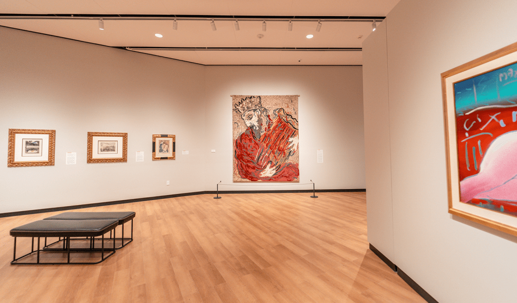
Accurate illumination reinforcing painting value and authenticity
Lighting for paintings is not about making artwork brighter. It is about making it honest through thoughtful art lighting techniques for paintings.
Paintings are one of the most demanding art forms to light. Colour relationships are subtle. Brushwork is intentional. Surface texture, varnish, glazing, and framing all interact with light in ways that are easy to disrupt and difficult to correct. When lighting is wrong, paintings feel flat, distorted, or uncomfortable to view. When lighting is right, paintings feel present, confident, and complete.
This is why serious galleries, museums, and collectors treat lighting as part of the artwork’s presentation rather than an afterthought.
This complete art gallery lighting guide explains how lighting for paintings should be approached professionally, why generic lighting solutions consistently fail, and how purpose-built systems using track lighting, Zoom, Multi, and Deluxe solutions deliver consistent, gallery-grade results.
Why paintings require specialist lighting

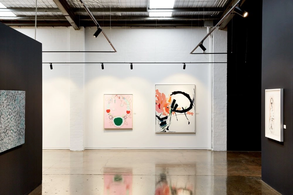
Precision spotlight revealing layered pigment and brushwork texture
Paintings may appear flat, but they are visually complex objects.
Light interacts with:
• Pigment density and layering
• Brushstroke relief and texture
• Canvas weave or panel grain
• Varnish and glazing
• Frame depth, colour, and finish
Poor lighting hides this complexity. It washes out tonal range, exaggerates reflections, and introduces glare that forces viewers to step back. Good lighting reveals detail gently and allows the painting to speak for itself.
Lighting for paintings must therefore be precise, controlled, and adjustable.

4.9-star rated by art collectors and gallery professionals
How people actually view paintings

Consistent colour maintained from multiple viewing angles
People do not look at paintings passively.
They move closer to inspect detail.
They step back to read composition.
They shift side to side as light plays across the surface.
Lighting must support this movement without changing colour, creating glare, or causing visual discomfort.
Professional lighting for paintings:
• Feels calm and effortless
• Allows long viewing periods
• Maintains colour consistency from different angles
• Keeps attention on the artwork, not the light
When lighting is uncomfortable, viewers disengage quickly even if the artwork itself is strong.
The connection between lighting and sales
Refined beam clarity reinforcing trust and value
Paintings are often the highest-value works in a gallery or collection.
Buyers need confidence that:
• Colours are accurate
• Texture is honest
• The work will translate into another space
Lighting directly affects that confidence.
Professional lighting for paintings:
• Shows true colour and tonal depth
• Enhances surface texture naturally
• Avoids glare on varnished or glazed works
• Signals care, expertise, and credibility
Poor lighting introduces doubt. Buyers may not articulate it, but hesitation grows. Decisions slow. Sales suffer.
Many galleries see improved dwell time and stronger conversion after correcting their painting lighting.
Why generic lighting fails for paintings

Wide architectural beam flattening tonal contrast
Many paintings are lit using:
• Decorative picture lights
• Architectural downlights
• Retail track lighting
These fittings are not designed for artwork.
Common problems include:
• Wide, uncontrolled beams
• Hotspots and uneven illumination
• Glare on glass or varnish
• Colour distortion
• Poor framing of the artwork
Generic lighting prioritises coverage and cost efficiency. Paintings require precision and control, which is why galleries rely on precision art lighting for paintings to reveal colour, texture, and detail accurately.
Lighting for paintings must start with a plan
Professional lighting for paintings always begins with a lighting plan.
A proper plan considers:
• Wall height and length
• Painting sizes and formats
• Viewing distances
• Track placement relative to walls
• Typical hanging heights
• Future exhibition changes
Without a plan, lighting becomes trial and error. Fixtures are adjusted endlessly and still never feel resolved.
A lighting plan ensures paintings can be presented consistently and confidently across exhibitions without compromise.
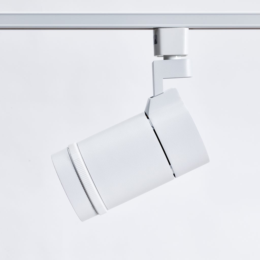
Track lighting as the foundation for painting lighting

Minimal ceiling track enabling precise artwork aiming
Track lighting is the backbone of professional lighting for paintings.
It allows:
• Precise aiming for each artwork
• Easy repositioning as exhibitions change
• Clean ceilings with minimal visual clutter
• Long-term flexibility
However, not all track lighting is suitable for paintings.
Gallery-grade track lighting differs fundamentally from generic architectural track systems.
Gallery track lighting vs generic track lighting
Minimal ceiling track enabling precise artwork aiming
Generic track lighting is designed for retail and architectural environments.
Gallery-grade track lighting for paintings prioritises:
• Precision optics
• Controlled beam edges
• Minimal glare
• High colour accuracy
• Visual restraint
This difference is immediately visible. Paintings lit with gallery-grade systems feel intentional and resolved. Paintings lit with generic track lighting often feel flat or visually uncomfortable.
Beam control is critical when lighting paintings

Reduced spill protecting adjacent displayed paintings
Paintings demand tight control of light.
Controlled beams:
• Frame paintings cleanly
• Prevent spill onto adjacent works
• Preserve contrast and depth
• Reduce reflections
Wide beams wash out paintings and reduce impact. Precision beams give paintings presence and clarity.
Professional lighting for paintings and artwork prioritises optics over raw output.
The importance of dimming when lighting paintings

Smooth dimming balancing varied painting sizes
Dimming is not about atmosphere. It is about control.
Paintings vary significantly in:
• Size
• Medium
• Pigment density
• Surface reflectivity
• Sensitivity to light
Fixed-output lighting forces compromise. Some works become overlit while others feel underwhelming.
Professional lighting for paintings must allow smooth, precise dimming so light levels can be tuned to each artwork rather than dictated by the fixture.
Good dimming allows galleries and collectors to:
• Balance paintings of different sizes on the same wall
• Reduce glare on varnished or glazed works
• Adjust emphasis without changing beam angle
• Protect sensitive works from excessive exposure
• Fine-tune presentation during installation and rehanging
Dimming must be stable and predictable. Flicker, stepping, or colour shift instantly undermine presentation quality.
Why CRI 97+ matters for lighting paintings

Accurate whites maintained without yellow or grey shift
CRI measures how accurately a light source renders colour. For paintings, this is non-negotiable.
Standard architectural lighting often sits around CRI 80–90. That may be acceptable for offices or retail. It is not acceptable for art.
Paintings rely on:
• Subtle colour transitions
• Layered pigments
• Warm and cool undertones
• Accurate whites and neutrals
Only CRI 97+ lighting can reveal these faithfully.
With lower CRI lighting:
• Colours appear muted or distorted
• Whites shift yellow or grey
• Blues and reds lose depth
• Buyers subconsciously lose trust
Professional lighting for paintings must use CRI 97+ LEDs to ensure what viewers see is honest and consistent.
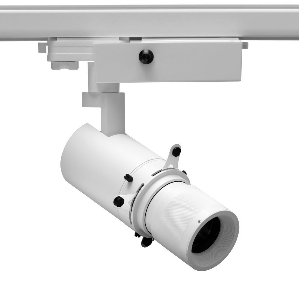
Zoom lighting for paintings of varying sizes
Wider coverage achieved for large canvases
Zoom lighting systems are ideal for spaces displaying paintings of different dimensions.
Zoom allows:
• Adjustable beam angles from a single fixture
• Tight framing for small works
• Wider coverage for large paintings
• Fast adaptation during rehanging
Rather than changing fixtures, the beam adjusts to the artwork. This makes Zoom systems a practical and professional foundation for painting lighting.
Zoom lighting pairs especially well with dimming, allowing beam size and intensity to be balanced together.
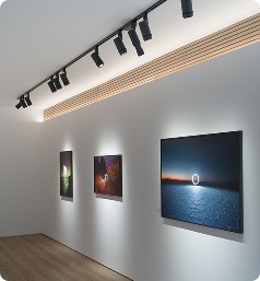
Multi lighting for curated painting displays

Cohesive lighting treatments across mixed styles
Multi lighting systems are used when painting exhibitions require nuance.
They are particularly effective when:
• Paintings vary significantly in scale or style
• Certain works require emphasis
• Curatorial hierarchy matters
• Master paintings are present
Multi systems allow different lighting treatments within the same exhibition while maintaining cohesion across the space.
This is especially valuable when combining feature works with more sensitive or secondary pieces.
Deluxe lighting for high-value paintings
Museum grade spotlight delivering exceptional beam quality
Deluxe lighting systems are chosen for galleries and collections showing high-value paintings.
They are used where:
• Presentation quality must be unquestionable
• Colour fidelity is critical
• Dimming stability is essential
• Visual intrusion must be minimal
Deluxe systems combine:
• Exceptional beam quality
• CRI 97+ colour accuracy
• Smooth, stable dimming
• Long-term consistency
In these environments, lighting should disappear completely, allowing the painting to command full attention.
Colour temperature for lighting paintings

Warm 2700K spotlight enhancing emotional presence
Most professional galleries light paintings at 3000K.
3000K:
• Feels warm yet neutral
• Preserves colour accuracy
• Supports a wide range of painting styles
• Builds buyer confidence
Some galleries use 2700K selectively on master paintings where warmth enhances emotional presence. This must be done carefully to avoid yellowing whites or distorting cooler tones.
Cooler temperatures are rarely used for paintings as they flatten tonal nuance and feel clinical.
Managing glare on paintings

Precision optics reducing reflections on glossy varnish
Glare is one of the most common failures in painting lighting.
Professional lighting addresses glare through:
• Precision optics
• Correct beam angles
• Proper track placement
• Thoughtful dimming
When glare is controlled, viewers can approach paintings comfortably and engage fully with surface detail.
Consistency across painting displays

Uniform light levels maintained across gallery walls
Consistency is critical when lighting paintings.
Lighting should:
• Match in colour and intensity across fixtures
• Feel balanced wall to wall
• Remain stable over time
Inconsistent lighting undermines trust. Collectors notice when paintings look different depending on where they hang.
Professional systems are engineered to maintain consistency exhibition after exhibition.
Long-term thinking in lighting for paintings

Flexible track infrastructure prepared for rehanging
Lighting for paintings should be designed once, properly.
A professional system allows:
• Years of exhibitions without replacement
• Easy rehanging
• Reduced maintenance
• Long-term cost efficiency
Short-term fixes always lead to long-term compromise.
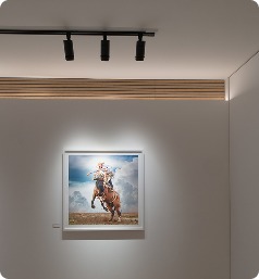
Beam Angle and Its Effect on Painting Clarity
Beam angle plays a defining role in how a painting is perceived within a space. While often overlooked, it directly controls how light is distributed across the artwork and how clearly the painting is separated from its surroundings.
Narrow beam angles are typically used to create focus. They concentrate light onto the painting, reducing spill and increasing contrast between the artwork and the wall. This approach is particularly effective for smaller works or paintings that require emphasis within a curated display.
Wider beam angles are more appropriate for larger paintings. They ensure that the entire surface is illuminated evenly without creating hotspots in the centre or falloff at the edges. Without proper beam selection, even high-quality lighting can produce inconsistent results.
Professional lighting systems allow for precise beam control or adjustable optics. This ensures that each painting, regardless of size, is presented with clarity, balance, and intention.
Positioning and Aiming of Light for Paintings

Fixtures aimed at thirty degrees to minimize distracting surface glare.
Correct positioning of lighting is just as important as the fixture itself. Even the best lighting system will fail if it is not aimed properly.
The angle of light must:
• Minimise glare on varnished or glazed surfaces
• Maintain even illumination across the painting
• Avoid casting distracting shadows
• Support comfortable viewing from multiple positions
A common professional approach is to aim lighting at approximately 30 degrees from vertical. This reduces reflection while preserving texture and depth. However, this is not a fixed rule. Each painting may require slight adjustment depending on its surface and placement.
Accurate aiming ensures that the viewer experiences the painting as intended, without distraction or distortion.
Lighting Large Paintings Without Losing Control
Large paintings introduce additional complexity. Standard lighting approaches often fail because the scale of the artwork exceeds the coverage of a single fixture.
Challenges include:
• Maintaining even brightness across the full width
• Avoiding visible overlap between multiple beams
• Preventing dark edges or overlit centres
Solutions typically involve:
• Using wider beam angles or zoom-adjustable fixtures
• Positioning multiple lights with careful spacing
• Balancing intensity between fixtures
When done correctly, large paintings appear evenly illuminated and visually stable, regardless of viewing distance.
Creating Visual Hierarchy Through Lighting

Tighter beams guiding visitor attention toward key focal art pieces.
Not every painting in a gallery holds the same importance. Lighting can be used to subtly guide attention and establish hierarchy within an exhibition.
This can be achieved by:
• Slightly increasing intensity on key works
• Using tighter beams for featured paintings
• Maintaining softer lighting for secondary pieces
The goal is not to create obvious contrast, but to gently influence how viewers move through the space. When hierarchy is handled well, it feels natural and unforced.
Lighting becomes a curatorial tool, supporting the narrative of the exhibition without drawing attention to itself.
The Importance of Uniform Light Distribution
Uniformity is essential when lighting paintings, especially when multiple works are displayed on the same wall.
Inconsistent lighting can result in:
• Some paintings appearing more important unintentionally
• Visual imbalance across the gallery
• Reduced trust from viewers and collectors
Uniform distribution ensures that:
• Paintings are presented fairly
• Walls feel cohesive
• The overall environment remains calm and professional
Achieving this requires high-quality optics and careful planning of fixture spacing and output.
Managing Shadows Around Frames and Canvas Edges
Proper positioning minimizing unwanted shadows on deep frames and edges.
Frames and canvas depth can introduce subtle shadows that affect how a painting is perceived.
If lighting is poorly positioned:
• Shadows may appear along the top or sides of the frame
• The painting may feel visually detached from the wall
• Depth can be exaggerated in an unintended way
Proper lighting minimises unwanted shadows while still allowing natural depth to be visible. This balance ensures that the painting and its frame work together as a complete presentation.
Lighting Paintings in Mixed Exhibitions
Many galleries display paintings alongside other mediums such as sculpture, photography, or installation work. This creates additional challenges for lighting design.
Paintings typically require:
• Controlled, even illumination
• Minimal glare
• Accurate colour rendering
Other mediums may require:
• Dramatic contrast
• Directional lighting
• Different intensity levels
A flexible lighting system allows these needs to be met simultaneously without compromising the presentation of paintings.
Maintaining Colour Stability Over Time

Reliable LED performance ensuring consistent output across rotating gallery exhibitions.
Consistency is not only important within a single exhibition, but also over time. Lighting must remain stable to ensure that paintings are presented accurately across months or years.
Key considerations include:
• LED colour stability
• Reliable dimming performance
• Consistent output across fixtures
Poor-quality lighting can shift in colour or intensity over time, leading to inconsistent presentation. This is particularly problematic for galleries that rotate exhibitions frequently.
Professional systems are designed to maintain performance, ensuring that paintings always appear as intended.
Reducing Visual Fatigue in Gallery Spaces
Lighting affects not only how paintings look, but also how people feel within the space.
Harsh or inconsistent lighting can cause:
• Eye strain
• Reduced viewing time
• Difficulty focusing on artwork
Comfortable lighting:
• Feels soft and balanced
• Allows viewers to spend more time engaging with paintings
• Supports a relaxed and immersive environment
This is especially important in galleries where visitors are expected to spend extended periods viewing artwork.
Integrating Lighting Into Gallery Architecture

Integrated lighting systems prioritizing the artwork over the technical hardware.
Lighting should work seamlessly with the architecture of the gallery, not compete with it.
This includes:
• Clean ceiling lines with minimal visual clutter
• Discreet fixtures that do not draw attention
• Logical alignment with walls and display areas
When lighting is integrated well, it becomes almost invisible. The focus remains entirely on the paintings.
Poor integration, on the other hand, can distract from the artwork and disrupt the overall aesthetic of the space.
Flexibility for Changing Exhibitions
Galleries are dynamic environments. Paintings change, layouts evolve, and exhibitions are regularly updated.
Lighting systems must support this flexibility by allowing:
• Easy repositioning of fixtures
• Quick adjustment of beam angles
• Simple dimming changes
Track lighting systems are particularly effective in this regard, providing the adaptability needed for ongoing changes without requiring major reconfiguration.
Protecting Paintings Through Controlled Lighting

Controlled LED sources minimizing heat output and unnecessary light exposure.
While presentation is critical, preservation must also be considered. Excessive or poorly controlled lighting can contribute to long-term damage.
Professional lighting helps protect paintings by:
• Allowing precise control of light levels
• Reducing unnecessary exposure
• Minimising heat output
This ensures that paintings can be displayed safely without compromising their condition over time.
Enhancing Depth and Dimension
Although paintings are two-dimensional, lighting can enhance their sense of depth.
Subtle directional lighting can:
• Reveal brushstroke texture
• Emphasise layering of paint
• Create a sense of dimensionality
This adds richness to the viewing experience and allows viewers to appreciate the physical qualities of the artwork more fully.
Avoiding Common Lighting Mistakes

Balanced intensity across multiple works ensuring a professional display finish.
Even well-intentioned lighting setups can fail if key principles are overlooked.
Common mistakes include:
• Using overly wide beams
• Placing fixtures too close or too far from the wall
• Ignoring glare on reflective surfaces
• Failing to balance intensity across multiple works
Avoiding these issues requires both the right equipment and a clear understanding of how light interacts with paintings.
Fine-Tuning Lighting During Installation
Even with a well-designed lighting plan, the final stage of installation is where painting lighting is truly resolved. This is the moment where precision adjustments transform a technically correct setup into a visually refined presentation.
Each painting should be assessed individually once installed. Small adjustments to beam angle, intensity, and aiming direction can significantly improve how the artwork is perceived. This process is not about major changes, but subtle refinements that bring balance and clarity.
During installation, professionals typically:
• Adjust each fixture to eliminate minor glare
• Fine-tune brightness to match neighbouring works
• Check consistency from multiple viewing positions
• Refine beam edges to align cleanly with the painting
This stage requires patience and attention to detail. Rushed installation often results in lighting that feels slightly unresolved, even if the system itself is high quality.
The Importance of Viewing Paintings in Context

Intentional transitions between artworks supporting the overall exhibition visual flow.
Paintings are rarely experienced in isolation. Their lighting must be considered in relation to surrounding works, wall colour, and overall gallery environment.
A painting that looks balanced on its own may feel too bright or too subdued when placed alongside others. This is why final lighting adjustments should always be made in context rather than individually.
Considering the wider space allows for:
• Better visual harmony across walls
• Consistent viewer experience throughout the gallery
• More intentional transitions between artworks
Lighting decisions should support the exhibition as a whole, not just individual pieces.
Achieving a Resolved and Professional Finish
The difference between adequate lighting and professional lighting often comes down to refinement. When every element is aligned—beam control, intensity, colour accuracy, and positioning—the result feels effortless.
Viewers may not consciously notice the lighting, but they will feel its effect. Paintings appear stable, colours feel trustworthy, and the overall environment encourages engagement.
This level of finish is what distinguishes professional gallery lighting. It ensures that every painting is presented with clarity, confidence, and respect for the artwork.
Final Addition to Professional Painting Lighting

Enhanced viewing experiences reinforcing the integrity of the gallery environment.
Lighting for paintings is a discipline that combines technical precision with visual sensitivity. Every decision, from beam angle to fixture placement, contributes to how the artwork is experienced.
When approached professionally, lighting does more than illuminate. It supports the integrity of the painting, enhances the viewing experience, and reinforces the overall quality of the gallery environment.
This level of attention ensures that paintings are not only seen, but understood and appreciated in the way they were intended.
Frequently Asked Questions
Lighting for paintings
What is the best lighting for paintings?
The best lighting for paintings is track-based gallery lighting with CRI 97+ colour accuracy, smooth dimming, and precise beam control. This ensures accurate colour, reduced glare, and flexibility as artwork changes.
Why is CRI 97+ important when lighting paintings?
CRI 97+ ensures colours are rendered truthfully. Paintings rely on subtle pigment relationships that are lost under lower CRI lighting. High CRI lighting builds trust with artists and buyers.
Should lights for paintings be dimmable?
Yes. Dimming is essential. Paintings vary in sensitivity, surface reflectivity, and scale. Dimmable lighting allows precise control without changing fixtures.
Is LED lighting suitable for paintings?
Yes. Professional-grade LED lighting is the preferred choice for galleries and museums. When specified correctly, LED offers CRI 97+ accuracy, low heat, long-term stability, and excellent dimming performance.
Is track lighting best lights for illuminating paintings?
Track lighting is preferred because it allows precise aiming, easy repositioning, and flexibility as displays change. The fixtures must be designed specifically for art, not retail.
What colour temperature should be used for lighting paintings?
Most professional galleries use 3000K. It is neutral yet warm and supports accurate colour perception. 2700K may be used selectively for master works.
How do you avoid glare when lighting paintings?
Glare is avoided through controlled optics, correct aiming angles, appropriate track placement, and careful dimming.
Final perspective on lighting for paintings
Lighting for paintings is not decorative. It is part of the artwork’s presentation.
When lighting is done properly:
• Paintings feel present
• Colour and texture are revealed honestly
• Visitors engage longer
• Buyers feel confident
• The reputation of the gallery or collection strengthens
This is the role of professional lighting for paintings.
Why galleries choose Banno Lighting
Galleries and collectors choose Banno Lighting because we understand how to light large paintings properly and approach painting lighting at a professional gallery level.
We provide:
• Expert guidance
• Professional lighting plans
• Track-based painting lighting systems
• Zoom, Multi, and Deluxe solutions
• CRI 97+ colour accuracy
• Smooth, stable dimming
• Long-term support
If you want lighting for paintings that respects the artwork, supports sales, and adapts over time, museum-grade painting lighting methods, professional systems and guidance are essential.
Work with proven art lighting specialists