Why 3000K Is the Standard and When 2700K Is Used on Master Works?
Master artwork illuminated with intentionally warmer light
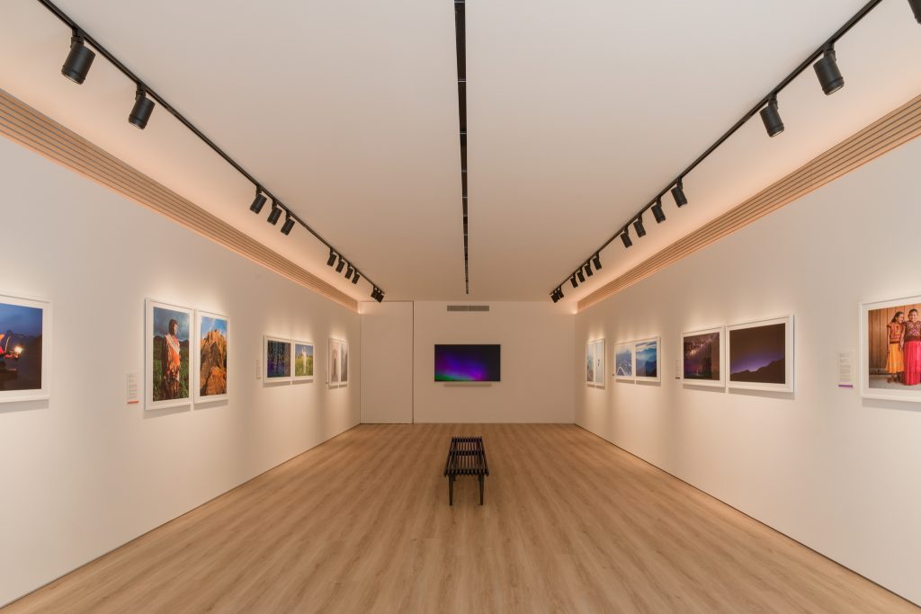
Within gallery lighting design fundamentals, color temperature is one of the most misunderstood and most influential aspects of art gallery lighting.
Ask ten galleries what color temperature they use and nine will say the same thing.
3000K.
That is not a coincidence. It is the result of decades of gallery, museum, and collector experience. Yet within that rule, there are important exceptions. Some galleries intentionally use 2700K on master works, particularly where Multi control is not used or where emotional warmth is prioritised over strict neutrality.
This complete art gallery lighting guide explains how color temperature actually works in galleries, how it affects perception and sales, why 3000K dominates professional spaces, and when 2700K is deliberately chosen.
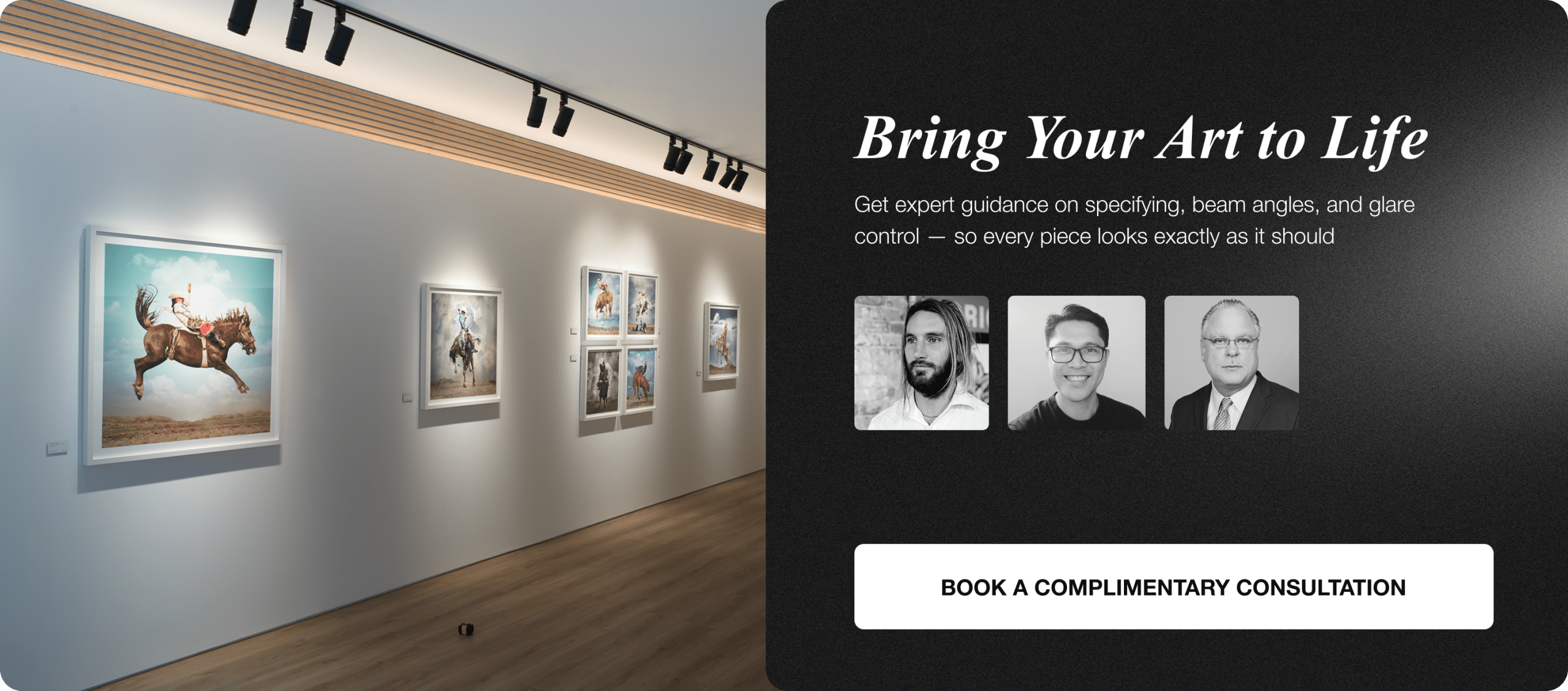
At Banno Lighting, we guide galleries through these decisions using professional gallery lighting solutions such as Zoom, Multi, and Deluxe systems so color temperature becomes a strategic tool rather than a guessing game.
What color temperature really means in a gallery context?

Color temperature demonstration inside contemporary exhibition space
Color temperature is measured in Kelvin and describes how warm or cool light appears.
Lower numbers feel warmer and more amber.
Higher numbers feel cooler and more neutral.
In galleries, color temperature affects:
• How colours are perceived
• How materials and textures appear
• Emotional response to artwork
• Perceived age and value of works
• Buyer confidence
This is not a technical preference. It is a psychological and commercial one.
A gallery’s color temperature sets the baseline emotional tone of the entire space.
4.9 stars & reviews from art collectors and galleries
Why 3000K is used in 99 percent of professional galleries?
Consistent 3000K lighting across mixed medium exhibition
There is a reason almost every serious gallery defaults to 3000K.
3000K sits in a critical sweet spot. It is warm enough to feel inviting and human, yet neutral enough to respect colour accuracy across a wide range of artworks.
The key reasons 3000K dominates
- Colour accuracy across mixed works
Most exhibitions include a mix of mediums. Paintings, photography, sculpture, works on paper, and mixed media often coexist in the same space. 3000K, commonly used in museum-grade lighting for paintings, handles this diversity better than warmer or cooler temperatures. - Buyer confidence
Collectors want to know what they are buying. 3000K gives confidence that colours are being presented honestly and will translate well into homes, offices, and collections. - Neutral emotional baseline
3000K feels calm and considered. It does not impose a strong mood. It allows the artwork to speak rather than the lighting. - Consistency across walls and exhibitions
When galleries change exhibitions frequently, 3000K provides a stable foundation that works regardless of artist or style.
This is why 3000K has become the professional standard, widely regarded as one of the ideal lighting choices for paintings rather than a trend.
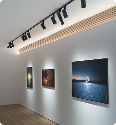
How color temperature affects the gallery experience?

Calm exhibition space under balanced 3000K lighting
A gallery is an experience before it is a sales environment.
Lighting colour temperature shapes that experience in subtle but powerful ways.
At 3000K:
• Spaces feel calm and intentional
• Visitors slow down naturally
• Colours feel believable
• Contrast feels balanced
• The lighting fades into the background
This encourages longer dwell time and deeper engagement, both of which are directly linked to sales outcomes.
When color temperature is too warm or too cool, the experience becomes about the lighting rather than the art.
Why cooler temperatures are rarely used in galleries?
3000K lighting preferred over cooler white gallery illumination
Cooler temperatures such as 3500K or 4000K are common in offices and retail environments but are generally avoided in galleries.
They tend to:
• Flatten colours
• Reduce emotional warmth
• Feel clinical or commercial
• Break immersion
While cooler light can increase perceived brightness, brightness is not the goal in art galleries. Presence and depth are.
For this reason, professional galleries almost never use cool white lighting for artwork presentation.
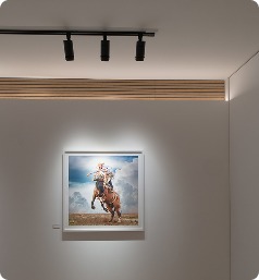
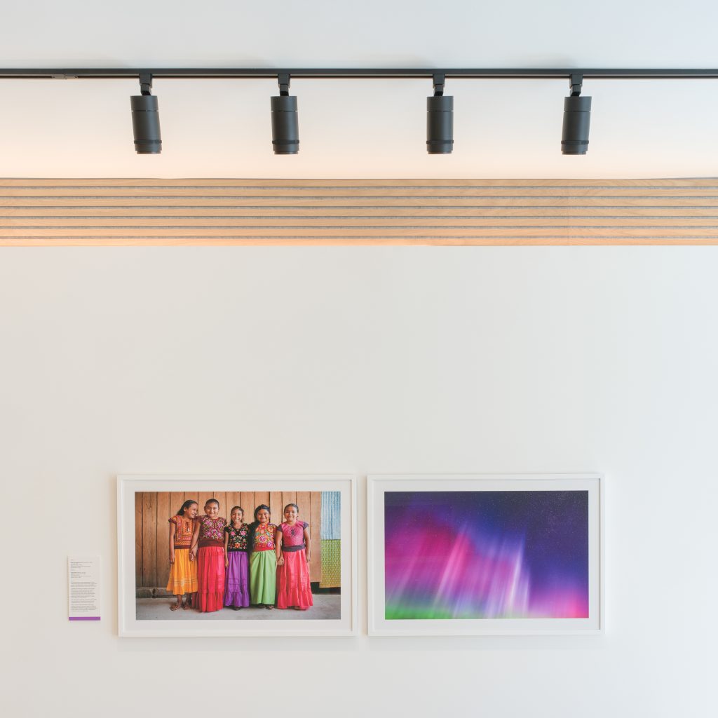
The role of 2700K in art galleries

Warm 2700K spotlight enhancing texture and richness
While 3000K is the standard, 2700K does have a place in certain contexts.
2700K is warmer and more amber. It introduces a sense of intimacy, softness, and richness. Used incorrectly, it can distort colour. Used intentionally, it can elevate specific works.
This is why 2700K is sometimes used on master works.
Why some galleries use 2700K on master artworks?

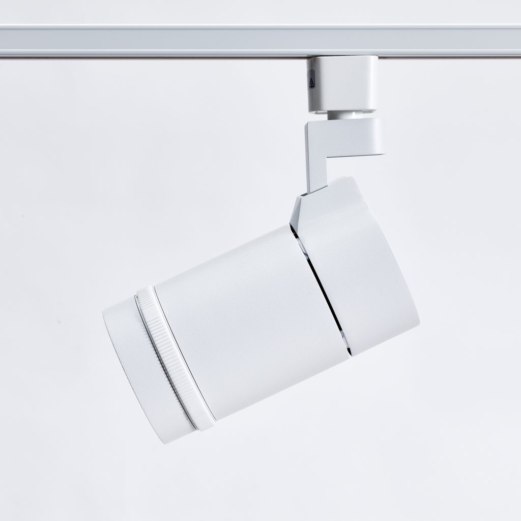
Deluxe Lighting Fixture
Master works often carry emotional, historical, or material weight that benefits from warmth.
Galleries may choose 2700K when:
• The artwork is historically significant
• Warm pigments dominate the piece
• Texture and materiality are more important than neutrality
• Emotional presence is prioritised
• The work is isolated or featured
The warmth of 2700K can make certain works feel richer, more tactile, and more alive.
However, this choice must be controlled carefully.
The risk of using 2700K without proper control
The reason 2700K is not used more widely is simple.
Without control, it creates problems.
Uncontrolled 2700K can:
• Yellow whites
• Mute blues and greens
• Distort photographic work
• Reduce consistency across walls
• Confuse buyers
This is especially risky in galleries that do not have the ability to fine tune lighting on a per artwork basis.
How Multi systems change the conversation around color temperature?

Multi lighting system balancing varied artwork treatments
This is where Multi lighting systems become critical.
Multi allows galleries to:
• Control lighting more precisely per artwork
• Layer different treatments within the same space
• Maintain overall consistency while making exceptions
• Use warmer tones selectively without compromising the room
In galleries using Multi systems, it is possible to:
• Keep the gallery at 3000K
• Feature master works at 2700K
• Maintain visual harmony
• Avoid colour confusion
Without Multi control, using mixed color temperatures becomes risky and often visually messy.
This is why many galleries only use 2700K on masters when Multi systems are not involved or when the master work is isolated.
Zoom lighting and color temperature flexibility
Controlled light spill preserving surrounding neutrality
Zoom lighting supports color temperature strategy by controlling beam size and emphasis.
While Zoom does not change color temperature itself, it allows:
• Focused emphasis on specific works
• Reduced light spill
• Better isolation of feature pieces
This makes subtle warmth differences less disruptive because the viewer’s attention is tightly controlled.
Zoom is often used alongside 3000K as a flexible, exhibition friendly solution that avoids the need for warmer temperatures.
Deluxe lighting and colour integrity

Deluxe fixture delivering precise neutral illumination
Deluxe lighting systems are typically used where color integrity must be unquestionable.
In these environments:
• 3000K is almost always the baseline
• Colour stability over time is critical
• Any deviation must be intentional and justified
Deluxe systems are chosen by galleries and museums that want absolute confidence that what is seen is what exists.
When 2700K is used in Deluxe environments, it is done with extreme restraint and purpose.
How color temperature affects sales psychology?

Emotional engagement shaped by subtle lighting warmth
From a sales perspective, color temperature influences trust.
Buyers ask themselves silently:
Will this artwork look the same elsewhere
Am I seeing the true colours
Is this gallery presenting the work honestly
3000K answers those questions positively for most people.
Overly warm lighting can feel seductive but risky. Buyers may enjoy the moment yet hesitate to commit.
This is why most commercial galleries default to 3000K and reserve 2700K for rare, deliberate moments.
A practical guideline for galleries

Structured gallery wall with balanced illumination
For most galleries, the best approach is simple when guided by museum and gallery lighting guidelines.
- Use 3000K as the default across the gallery
- Maintain consistency wall to wall
- Use Zoom to adapt to different artwork sizes
- Use Multi if you want to feature masters differently
- Use 2700K only intentionally and sparingly
- Never mix temperatures casually
This approach protects experience, sales, and reputation.
Why generic advice fails around color temperature?
Generic lighting advice often treats color temperature as a stylistic choice.
In galleries, it is not.
It is a curatorial and commercial decision that affects:
• How art is perceived
• How long visitors stay
• How confident buyers feel
• How professional the gallery appears
This is why galleries need guidance, not rules of thumb.
Our role in guiding color temperature decisions

Detailed lighting layout including temperature mapping
At Banno Lighting, we help galleries decide:
• Which color temperature is appropriate
• Where exceptions make sense
• How to implement them without risk
• Which systems support flexibility
• How to plan for future exhibitions
We do not push trends. We guide decisions based on experience, context, and long term outcomes.
Final principle on art gallery color temperature

Warm highlight used sparingly on focal piece
Color temperature should never compete with the artwork.
In most cases, 3000K is the quiet, confident choice that respects the widest range of art and buyers.
2700K has power, but only when used deliberately, sparingly, and with control.
When lighting decisions are made with intent, the gallery experience feels resolved, the art feels honest, and buyers feel confident.
That is the purpose of professional art gallery lighting.
Why galleries trust Banno Lighting?
Galleries work with Banno Lighting because we understand that lighting decisions are not just technical. They are emotional, experiential, and commercial.
We provide:
• Expert guidance
• Lighting plans
• Zoom, Multi, and Deluxe systems
• Long term support
If you want clarity and confidence around art gallery lighting color temperature, including high CRI lighting for artwork, we are here to guide you.
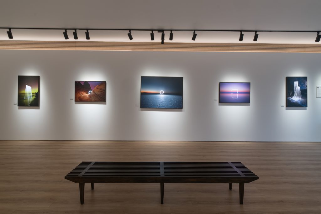
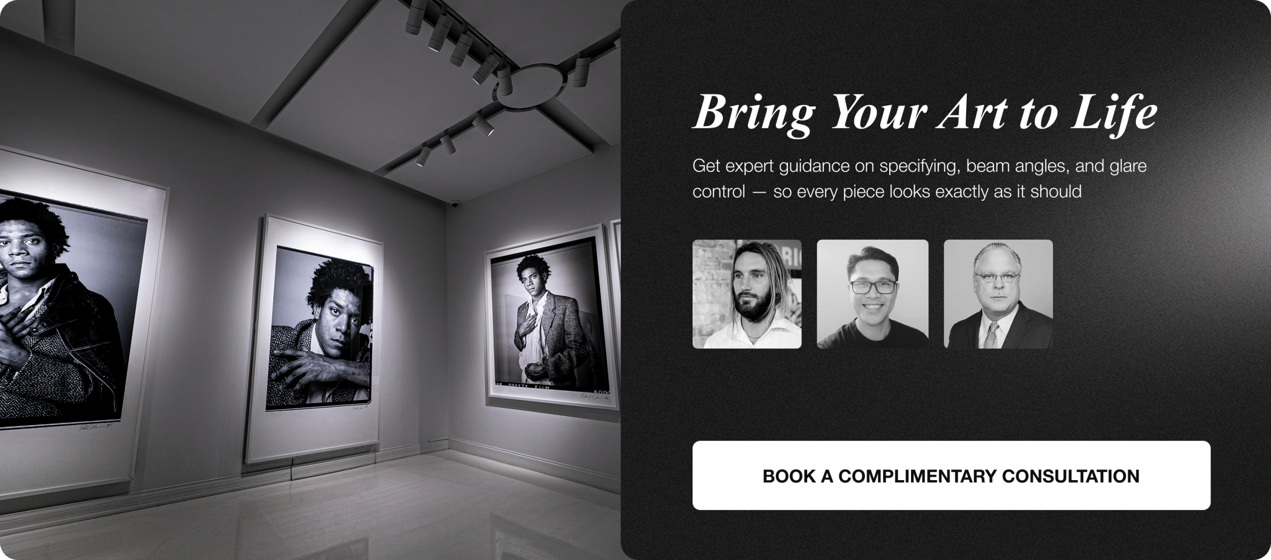
How to Choose the Best Color Temperature for Different Types of Artwork

Mixed artworks displayed with balanced lighting maintaining accurate visual appearance
Choosing the right color temperature is not about preference. It is about how different artworks respond to light.
While 3000K works as a reliable baseline, each medium behaves differently under illumination.
Paintings, especially oil works, benefit from balanced neutrality. 3000K reveals true pigment relationships without exaggerating warmth or flattening depth.
Works on paper require more sensitivity. Excess warmth can yellow the surface, while cooler tones make them feel harsh. Neutral lighting keeps them accurate and stable.
Photography introduces reflections and surface glare. This makes control more important than warmth. A neutral temperature combined with precise beam direction maintains clarity.
Sculpture relies less on temperature and more on light direction. However, 3000K still provides the most consistent base for defining form without distortion.
Mixed media works are the most demanding. Different materials react differently, so consistency in temperature becomes critical.
The goal is not constant adjustment. It is controlled consistency across all mediums.
How Color Temperature Interacts with Materials and Finishes
Material changes everything.
Two artworks with the same color can appear completely different depending on surface finish.
Glossy surfaces reflect more light. This increases glare and amplifies warmth. Under 2700K, these surfaces can look overly rich or distorted.
Matte surfaces absorb light. They create a softer, more even appearance and handle warmth slightly better.
Metallic elements are more complex. They shift depending on light source and angle. Neutral temperature helps maintain control.
Textured works respond strongly to directional lighting. Here, angle matters more than temperature, but consistency still plays a role.
Understanding material response prevents unexpected visual shifts.
The Relationship Between Color Temperature and Wall Colour

Dark walls increasing contrast and focus on illuminated artwork display
Lighting does not exist in isolation. Wall color directly affects perception.
White walls reflect light strongly. Under 3000K, they feel clean and balanced. Under 2700K, they can appear slightly yellow.
Dark walls absorb light and increase contrast. This creates focus, but requires careful control to maintain clarity.
Neutral walls provide flexibility. They allow galleries to maintain consistency across changing exhibitions.
The wrong combination of wall color and lighting can distort the entire space.
This is why both must be considered together from the start.
Why Consistency Matters More Than Preference
Color temperature is not a personal choice in galleries.
It is a system decision.
When lighting is inconsistent:
-
Artworks feel disconnected
-
The space loses structure
-
Attention becomes fragmented
-
The experience feels unprofessional
Consistency creates trust.
It allows visitors to compare works naturally and move through the space without distraction.
Even when variation is used, it must feel intentional.
Random inconsistency is one of the fastest ways to reduce perceived quality.
How Inconsistent Lighting Affects Buyer Perception
Buyers are highly sensitive to inconsistency.
Even if they cannot explain it, they feel it.
When lighting varies:
-
Colours feel unreliable
-
Comparisons become difficult
-
Confidence drops
-
Decisions slow down
This hesitation often happens subconsciously.
A collector may step back, hesitate, or delay without knowing why.
Consistent lighting removes that friction.
It creates clarity, and clarity builds confidence.
Balancing Warmth and Neutrality in Gallery Spaces

Balanced lighting combining warmth and neutrality across gallery space
The challenge is not choosing warm or neutral.
It is finding balance.
Too warm:
-
Distorts colour
-
Feels stylised
-
Reduces trust
Too cool:
-
Feels clinical
-
Reduces emotional connection
-
Flattens the experience
3000K works because it sits between both extremes.
It feels natural without interfering.
When 2700K is used, it must support the artwork, not dominate it.
How Lighting Influences Time Spent in a Gallery

Visitors spending more time in comfortable and well lit gallery space
Lighting directly affects behaviour.
In well-lit spaces:
-
Visitors slow down
-
Engagement increases
-
Attention deepens
In poorly lit spaces:
-
Visitors move quickly
-
Engagement drops
-
Fatigue increases
Color temperature contributes to comfort.
Comfort leads to longer visits.
Longer visits increase the likelihood of meaningful interaction and sales.
The Importance of Testing Before Final Decisions
Lighting should never be decided in theory alone.
Testing is essential.
Professional galleries:
-
Test lighting on real artworks
-
Review from multiple angles
-
Compare across mediums
-
Adjust based on observation
Small differences in temperature can create noticeable changes.
Testing ensures decisions are based on reality, not assumption.
Adapting Color Temperature Without Disrupting the Space

Consistent gallery lighting maintained with minimal visual disruption
Variation must be controlled.
Not all artworks need identical treatment, but changes must be subtle.
Key principles:
-
Keep a dominant baseline
-
Limit variation to focal works
-
Control beam spread
-
Avoid overlap between temperatures
The viewer should feel the effect, not notice the technique.
Good lighting feels natural, not forced.
How Professional Systems Support Color Temperature Strategy
Execution depends on the system.
Without the right tools, even good decisions fail.
Professional lighting systems allow:
-
Precise control per artwork
-
Consistent output across fixtures
-
Flexibility for new exhibitions
-
Reliable long-term performance
This level of control is what makes strategies possible.
Without it, consistency becomes difficult to maintain.
Long-Term Considerations for Gallery Lighting

Adjustable fixtures supporting future exhibitions and artwork changes
Lighting is a long-term investment.
It must support the gallery beyond a single exhibition.
Important considerations:
-
Consistency across changing shows
-
Stable color output over time
-
Ease of adjustment
-
System scalability
A strong system reduces future problems.
It ensures quality remains consistent as the gallery evolves.
Common Misconceptions About Color Temperature
Several misconceptions lead to poor results.
Warmer light does not always improve art. It can distort color if overused.
Brighter light does not always improve visibility. It can increase glare and discomfort.
Uniform treatment does not always create quality. Some variation is necessary when controlled.
Understanding these misconceptions helps avoid costly mistakes.
Final Insight: Control Creates Confidence

Professional gallery space with subtle lighting enhancing artwork visibility
Color temperature is a tool, not a setting.
When controlled properly:
-
Art appears accurate
-
Spaces feel calm
-
Visitors stay longer
-
Buyers feel confident
The best lighting is not noticeable.
It supports the artwork quietly and effectively.
That is what defines a professional gallery environment.
FAQs
1. What is the best color temperature for art gallery lighting?
The best color temperature for most galleries is 3000K because it balances warmth and colour accuracy, making it suitable for a wide range of artworks.
2. Why is 3000K considered the standard in galleries?
3000K provides a neutral, consistent lighting environment that enhances artwork without adding unwanted colour bias or emotional distortion.
3. When should 2700K be used in gallery lighting?
2700K is typically used for master works where warmth enhances texture, emotion, and historical character.
4. Does color temperature affect how artwork looks?
Yes, color temperature directly impacts colour perception, contrast, texture visibility, and the overall emotional feel of the artwork.
5. Why do galleries avoid cooler lighting like 4000K?
Cooler lighting can make artwork feel flat, clinical, and less engaging, reducing emotional connection and perceived value.
6. How does lighting influence buyer confidence?
Accurate, neutral lighting like 3000K helps buyers trust that they are seeing true colours, increasing confidence in purchasing decisions.
7. What happens if lighting is too warm in a gallery?
Overly warm lighting can distort colours, especially whites, blues, and greens, making artworks appear less accurate.
8. Can different color temperatures be used in the same gallery?
Yes, but only with careful control, as systems like Multi allow galleries to mix temperatures without creating visual inconsistency.
9. What is the role of Multi lighting systems?
Multi systems allow precise control over individual artworks, enabling different lighting treatments while maintaining overall harmony.
10. How does Zoom lighting support gallery lighting design?
Zoom lighting controls beam size and focus, helping isolate artworks and reduce spill without changing color temperature.
11. What is Deluxe lighting used for in galleries?
Deluxe lighting is used where maximum colour accuracy and consistency are required, often in high-end galleries and museums.
12. Does color temperature affect the emotional experience of a gallery?
Yes, warmer tones create intimacy and richness, while neutral tones create calm and clarity, shaping how visitors feel in the space.
13. Why is consistency in color temperature important?
Consistency ensures all artworks are presented fairly and professionally, avoiding visual confusion across the gallery.
14. How does lighting impact dwell time in galleries?
Balanced lighting encourages visitors to stay longer, engage more deeply, and explore the exhibition at a comfortable pace.
15. Is brighter lighting better for galleries?
No, brightness alone is not the goal, as controlled lighting with proper contrast creates better visibility and atmosphere.
16. How does 2700K enhance master artworks?
2700K adds warmth that can highlight texture, deepen tones, and create a more immersive emotional connection with the piece.
17. What are the risks of using 2700K without control?
It can cause colour distortion, reduce consistency, and negatively impact buyer trust if not carefully managed.
18. How should galleries approach lighting for changing exhibitions?
They should use flexible systems like track lighting and adjustable fixtures to adapt quickly while maintaining consistency.
19. Why is color temperature considered a commercial decision?
Because it directly affects how artwork is perceived, how confident buyers feel, and ultimately how well pieces sell.
20. What is the key principle for choosing gallery lighting color temperature?
Use 3000K as the default and only use 2700K selectively and intentionally to enhance specific artworks without compromising consistency.
Hear from art collectors and clients who trust us